You’ve seen it a thousand times. That bright green square. The bold, white chemical symbols. It’s arguably the most recognizable piece of graphic design in television history. But when you really look at the breaking bad table of elements style, you realize it isn't just a clever aesthetic choice. It’s a literal roadmap for the show’s soul.
Most people just think, "Oh, science show, periodic table, cool." It goes deeper. Vince Gilligan and his design team didn't just pick random elements that looked pretty. They chose symbols that anchored the show's identity in the dirt, the lab, and the tragedy of Walter White’s transformation.
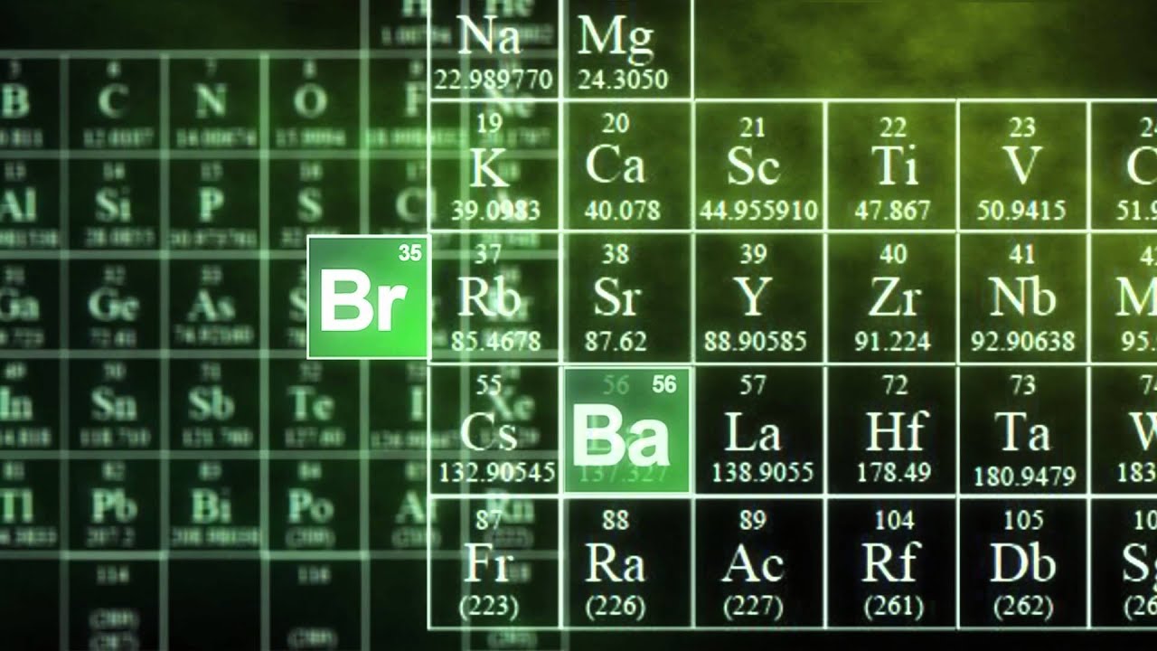
What’s Actually Inside the Breaking Bad Table of Elements?
Let's get technical for a second. The logo highlights two specific elements: Bromine (Br) and Barium (Ba).
In the periodic table, Bromine is atomic number 35. It’s a halogen. It’s nasty stuff—a deep red-brown liquid that gives off a sharp, choking odor. It’s corrosive. It burns. Barium, atomic number 56, is an alkaline earth metal. You might know it from those "barium swallow" cocktails doctors make you drink before an X-ray because it’s radiopaque. It makes things visible that were previously hidden.
Think about that.
The show is about a man who is corrosive to everyone he touches (Bromine) and a process that reveals the hidden, dark nature of a suburban father (Barium). Whether that was a conscious choice by the designers at Council Design or just a happy accident of chemistry, it fits perfectly.
The title sequence itself is a fever dream of chemical reactions. We see formulas for methamphetamine ($C_{10}H_{15}N$) floating by. We see the molecular weights. It’s a 30-second crash course in organic chemistry that sets the tone for a show that treated science as a superpower rather than a boring school subject.
The Chemistry of Branding
It’s kinda wild how one design choice spawned an entire subculture of "periodic table" memes. Honestly, you can’t go into a gift shop in Albuquerque or a Spencer’s Gifts without seeing someone’s name written in the breaking bad table of elements font.
It works because it’s modular.
Designers call this "systematized branding." By using the periodic table as a template, the show created a visual language that anyone could replicate. It wasn't just a logo; it was a kit. You take a name, find the corresponding elements—or just fake the boxes—and suddenly it’s "Br-anded."
But the real magic is in the color palette. That specific "Kryptonite green." It’s the color of toxic waste. It’s the color of money. It’s the color of the glowing vats you see in old 1950s sci-fi movies. It screams "danger" and "chemistry" simultaneously. In a sea of gritty, prestige TV dramas that were all using desaturated blues and greys back in 2008, Breaking Bad stood out because it embraced a vibrant, sickly neon.
Why the Science Actually Matters for the Fans
We have to talk about the "Blue Sky."
In the show, Walt’s meth is blue because it’s chemically pure. In reality? Pure meth is clear. Impurities usually make it yellowish or brown. The blue tint was a creative liberty taken by the writers to give the product a "brand."
This creates a weird tension with the breaking bad table of elements motif. The logo promises hard science. The periodic table is the ultimate source of truth in the universe. Yet, the show’s central plot device—the blue meth—is a bit of scientific fiction.
Does it matter? Not really.
The show hired Dr. Donna Nelson, a chemistry professor at the University of Oklahoma, to keep things grounded. She made sure the dialogue sounded right. She made sure the structures drawn on the chalkboard in Walt’s classroom weren't gibberish. This commitment to "truth-adjacent" science is why the periodic table imagery feels earned. It’s not just "science-y" wallpaper. It’s a tribute to the methodology Walt uses to justify his crimes.
The Evolution of the Table in Pop Culture
Look at how the imagery shifted over five seasons.
Early on, the green squares represented Walt’s geeky, suppressed intellect. By the end, they felt like a warning label. The breaking bad table of elements became shorthand for a specific kind of "smart-but-dangerous" anti-hero.
We saw it again in Better Call Saul, though they pivoted away from the periodic table to reflect Jimmy McGill’s world of cheap lawyering and neon strip malls. But the DNA remained. The fans never let go of the elements. Even today, you’ll find fan-made tables where every character is assigned an element based on their personality.
- Walter White: Is he Lead? Heavy, toxic, and used in bullets?
- Jesse Pinkman: Is he Helium? Light, prone to floating away, but essential?
- Gus Fring: Definitely Platinum. Cool, expensive, and incredibly stable under pressure.
This level of engagement is why the show’s visual identity has survived long after the finale. It invites people to play with the building blocks of the universe.
The Technical Design Specs
If you’re a designer trying to recreate this look, you’re probably looking for the font. It’s not a single "out of the box" font. The main typeface is a modified version of Bundy Hel or sometimes Cooper Medium, though many enthusiasts use Helvetica or Arial as a base and tweak the weights.
The squares themselves have a specific glow. It’s an outer glow effect with a slight gradient, making it look like a backlit periodic table from a dark university lab.
The green hex code is usually around #369457 or #477547, depending on which season’s promotional material you’re looking at. It’s a forest green that leans into the yellow spectrum just enough to look "chemical."
Myths About the Periodic Table Intro
There’s a common rumor that the elements shown in the opening credits spell out a secret message.
Sorta.
If you look at the names in the credits, the designers highlighted element symbols within the actors' names. For example, "Ch" in RJ Mitte’s name isn't a real element (though "C" for Carbon and "H" for Hydrogen are). They took some liberties to make the gimmick work across the board.
Another misconception: the formulas flying by are for explosives.
Actually, most of them are legitimate chemical structures related to the synthesis of methamphetamine or various precursors like Phenylacetone. The showrunners were careful. They didn't want to provide a literal "how-to" guide for a crime, so they often skipped steps or swapped chemicals in the dialogue, but the visual "vibe" of the chemistry was always based on real-world organic synthesis.
Practical Ways to Use the Breaking Bad Aesthetic
If you're looking to apply this "elemental" style to your own projects—whether it's a presentation, a gift, or a brand—there are a few rules to follow to keep it from looking like a cheap knockoff.
Focus on the Border
The border of the green square isn't a solid line. It has a slight "bleeding" effect, as if the ink is reacting with the paper. Use a thin, 1-point or 2-point stroke with a 10% blur.
The Numbering System
Don't forget the atomic number in the top left and the atomic weight at the bottom. If you’re making a custom square for a friend named "Dave," and you use "Da" as the symbol, give it a fake atomic number like "99" and a weight that means something to them, like their birth year. It adds that layer of "E-E-A-T" (Experience, Expertise, Authoritativeness, and Trustworthiness) to your design.
Contrast is King
The reason the breaking bad table of elements pops is the white-on-green contrast. Keep the background dark. If you put the green square on a white background, it loses its "forbidden lab" energy. It needs to live in the shadows.
Why It Still Matters in 2026
We are well over a decade removed from the series finale, yet the iconography remains. Why?
Because it represents the ultimate transformation.
Chemistry is the study of change. You take one substance, add heat or a catalyst, and it becomes something entirely different. That is the arc of Walter White. The periodic table isn't just a set of boxes; it’s a menu of possibilities.
When you see that logo, you aren't just seeing a title. You're seeing the promise of a story where "A" plus "B" equals "Destruction." It’s a masterclass in how to use academic symbols to tell a visceral, violent story.
To recreate or appreciate the Breaking Bad aesthetic properly, you have to embrace the precision of the lab. Use high-resolution assets. Stick to the "Bundy" style fonts. Don't over-saturate the greens. Most importantly, remember that the science was the catalyst for the drama, not just a gimmick.
Actionable Next Steps for Fans and Creators:
- Identify Your Element: Use a periodic table to find real elements that match your initials (e.g., "S" for Sulfur, "Al" for Aluminum).
- Match the Palette: Use hex code #1f4027 for the deep background and #3eb489 for the highlight green to get that authentic Albuquerque-at-midnight feel.
- Check the Facts: If you’re writing about the show, reference the actual atomic numbers (35 and 56) to maintain credibility with the hardcore fan base.
- Vary Your Layout: If designing a "Breaking Bad" themed layout, avoid perfect symmetry. The show was chaotic; your design should have a bit of that "industrial lab" grit.